Dialvetica Contacts app for iPhone and iPad
4.1 (
1511 ratings )
Utilities
Productivity
Developer:
Martin Barnard
0.99 USD
Current version:
2.4.1, last update: 7 years ago
First release : 24 Nov 2010
App size: 548.35 Kb
The fast contacts app for the iPhone
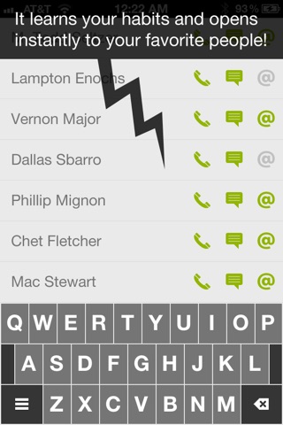
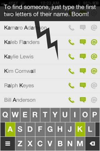
Your app should be smart enough to know who your favorites are. It should know what number you want to call. It should know who you mean when you type someones initials.
FEATURES
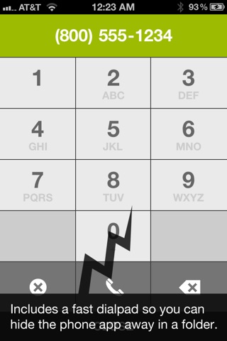
* Call, text or e-mail any contact in 1-3 taps
* Super clean design with custom qwerty keyboard
* Fast launch
* Is a great listener
* Learns who you call, text or e-mail the most and helps you find them faster (All stored locally, never shared)
* Almost makes it safe to make a call while driving. (But we cant say that)
* Features a theoretical shade of green that has never existed before (R:153 G:198 B:64). Back in the 90s Rob stated, "No, I believe this color exists!" And today we have it.
* Each tap on our keyboard equals 5 on yours
APPLE COMPLIMENTS
"New and Noteworthy" - Overall
"Whats Hot" - Overall
"Staff favorites" - Overall
"New and Noteworthy" - Productivity
"Whats Hot" - Productivity
NOTES
* This is not a contacts manager! It is a contact contacter
* iPods and iPads will only be able to e-mail, unless they have a google voice client they ask Dialvetica to use.
* This app has ONLY the features listed below. You are paying for speed, user experience and ease of use, not features.
* You must first USE Dialvetica to contact people before it can learn who your favorites are. When you first open the app, contacts will be unsorted.
RESOURCES
[email protected]
http://www.dialvetica.com
Pros and cons of Dialvetica Contacts app for iPhone and iPad
Dialvetica Contacts app good for
This app is so awesome that it was last updated more than a year ago and its still the best on the App Store! Sad to hear that its not being developed anymore =/
great idea... super design... it would be nice to have super stylish dialer;)
I really love the smarts of the app. It takes a bit to get used to the custom interface but I get the advantage of it.
I would love to have a "qwertz" version of the custom keyboard. Im so used to a have the "z" where your "y" is. Fortunately there are so many initials with z and y ;). I know there is the option to use the standard keyboard but it takes up to much space and feels weird with this app.
Being able to paste number in the dial pad few would be neat too.
But none of that takes away from the greatness of this app. Thanks!
(I know you cant respond here … so if I missed something feel free to reply to me on Twitter @ptujec)
I dont understand the low graphics in the Dial Pad and the "delete" sign in the keyboard (lower right corner)! Tbh its horrible to look at so I hope there will be an Update soon! The iPhone 4/4S is out long enough to get rid of those bad quality graphics! The rest looks pretty good, I hope it just gets better :D
Amazing app. Once again, the focus is on speed and simplicity. Having one app, to which 1-2 taps later, you can start texting/calling/emailing someone. As selfish as this sounds, I want the next app these guys are planning right now!
Love this... Great fast way to email, text or call any of your contacts. Worth a precious spot in the dock at the bottom of the screen.
Some bad moments
I am on 3G IOS 4.1 JB and I dont see any name - its showing a list but no names in it to be seen. Completely unusable
FOR 3 DAYS NO ANSWER FROM SUPPORT - APP is not working here. Shows empty list. This is a RIPP OFF
An absolutely unnecessary reduplication of some iPhone in-buit functions.
Great update to a fantastic application. I wish I could change it so the dial pad was just one tap away (I dont need to have the option for setting and the please read screen every time), but a wonderful app nonetheless. Thanks Mysterious Trousers!
Just got the newest update. It does definitely load faster. Noticeably faster!
Single minor complaint/suggestion.
- Id like the ability to *remove* or *turn off* the phone icon. I have the Seinfeld "man hands" and its easy for me to accidentally tap the call feature instead of the text feature.
Overall, another outstanding app from Mysterious Trousers. I so greatly wish just 1% of the apps in the app store were so thoroughly designed, thought out, executed, and beautiful.
it looks androidish, doesnt look consistent with rest of iphone apps. its own keyboard doesnt allow to change language, and list of contacts looks ugly with different font sizes for different contacts
This app rocks. I like how it automatically has my top contacts listed first. It let me put my Phone and Messages app away so more room on my home screen!
One qualm though...since I have moved away my default phone and messages app, whenever I get a voicemail or text I dont know as the Dialvetica icon does not have a badge icon.
PLEASE DEVELOPER! Have a badge icon for missed calls or unread texts!!


